A foldable with two wildly different aspect ratios exposed layout bugs no regular iPhone ever had: here's how we fixed them.
Eduardo··5 min read
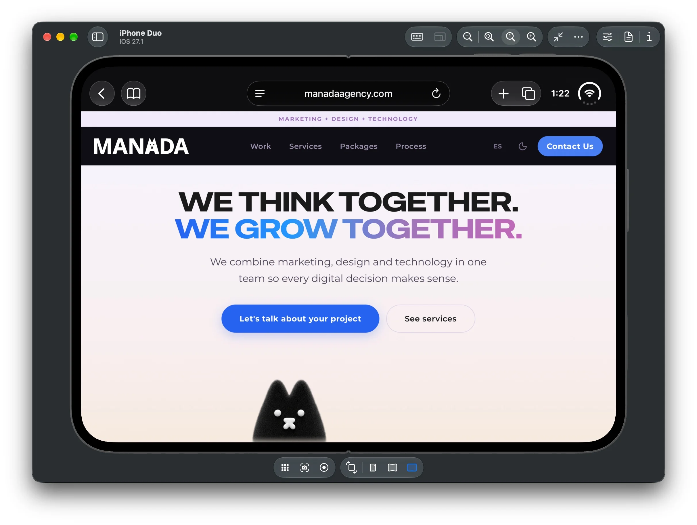
When we tested the site on the iPhone Duo simulator, Apple's new foldable, with a closed state (narrow, phone-like) and an open one (wide, almost tablet-sized), breakage started showing up that no regular iPhone had ever revealed: an animated mascot sliding out of position, a scroll-jacked section clipping its own content, an overcrowded header. None of this was a classic "responsive" bug tied to screen width: it was the combination of a device with two very different aspect states and a viewport height that Safari doesn't always report consistently.
Here's what we did to fix it.
1. The Hero mascot: from "floating" to actually anchored
The Hero has a mascot (HeroMascot) that positions itself in a bottom corner of the section, with a hover animation. The design intent: it should peek up from the bottom edge, slightly clipped by the fold, never covering the CTA button.
We found several related problems, layer by layer:
It covered the "View services" button on mobile. On narrow screens the CTA buttons stack into a column and grow taller than the original calculation accounted for. Fix: measure the content block's real position at runtime (getBoundingClientRect) and, if it encroaches on the space reserved for the mascot, push the mascot below the content instead of overlapping it.
It jumped during scroll on mobile. The real cause wasn't the resize listener; it was that the Hero used min-h-[90dvh]: in Safari, dvh changes continuously as the address bar collapses during scroll, so the whole section (and the mascot inside it) was resizing live at that exact moment. We switched to min-h-[90svh] (small viewport height): the minimum, stable value that doesn't move with Safari's chrome.
It sat "floating", detached from the real edge. We inspected the sprite (fox-directions.webp, a 3×3 grid at 1080×1080px) and confirmed the resting frame leaves ~24% of transparent space at the bottom of its own square. The component's box was flush with the edge, but the drawing inside it wasn't. We now compensate for that padding as a proportion of the rendered size, so it's the character, not the invisible box, that ends up flush with the bottom of the section.
It got cut in half on the Duo. We added a safety ceiling: no matter how short the section measures at runtime, no more than 40% of the mascot is ever clipped.
2. The real underlying problem: centering content on a wide-and-short screen
The open Duo was the hardest case. With its full desktop nav but a viewport noticeably shorter than a regular iPhone's, centering the Hero content (justify-center) left an equal margin above and below, and that margin wasn't enough room for the mascot.
#responsive-design
#css
#manada-agency
More from Manada Blog
There's no way to detect "this is an iPhone Duo" from CSS or JS: you can only measure dimensions, not device models. So instead of guessing a fixed breakpoint by screen size, we implemented dynamic detection: we measure whether, centered, the bottom margin would reach a reasonable minimum for the mascot; if it doesn't, the layout switches to a compact mode (content pinned to the top, less padding), and all the free space accumulates at the bottom instead of being split evenly. This approach adapts on its own to whatever the real device is, without risking other screen sizes that already worked fine.
3. The "Our pillars" section: a scroll-jack that didn't fit
This section uses GSAP ScrollTrigger to "pin" a full-screen panel while the user scrolls, revealing 9 steps (one per service). On mobile and in the in-between range (tablet/Duo), the layout broke for several reasons at once:
The "large" text, image, and tag sizes kicked in at the sm breakpoint (640px), but the row layout (text on the left, image on the right) only kicked in at lg (1024px). Between those two widths, right where the Duo lands, the content stayed stacked in a column but at desktop sizing, overflowing the panel.
The panel used h-dvh, with the same instability problem as the Hero.
The title block's top padding was a fixed value that didn't always clear the real height of the sticky header, leaving the title covered.
Fix: we aligned the row-layout breakpoint to md (768px, the same one the header already uses for its desktop nav), migrated to h-svh, and measure the header's real height at runtime to calculate the needed padding instead of guessing it.
4. Header: fewer fixed controls in the mobile bar
The language buttons (ES/EN) and light/dark mode toggle always lived in the top bar, even on mobile, competing for space with the logo and hamburger menu. We moved them into the mobile dropdown menu, leaving the top bar with just the logo and the menu icon; on desktop they stay where they were.
The general lesson
None of this was about "one more breakpoint." The pattern that kept repeating was: a device with an atypical width/height ratio breaks assumptions that hold fine across the normal iPhone range: specifically, any layout calculation that assumes "viewport height always gives enough room" or that uses dvh without accounting for it changing during scroll. The fix that scaled best wasn't adding more fixed breakpoints, but measuring real conditions at runtime (section height, content position, sprite padding) and deciding the layout from that; so the result adapts on its own to any screen proportion, present or future, instead of to one specific device model.